I expect you’ve heard the news … that the trend is your friend?
That’s all well and good … but what does it mean in practical terms, and how do we actually apply that in our trading?
If you Google ‘What’s a market trend?’, I expect you’ll come across some definitions along the lines of … ‘a series of higher highs and higher lows’ for an uptrend … and ‘a series of lower lows and lower highs’ for a downtrend.
And, maybe a picture like this …
That’s all well and good … but in the real world, price charts are never so tidy.
It’s estimated that markets trend only 30% of the time … which means that the rest of the time they are hovering sideways, and generally keeping us on our toes. When a trend hits … it can be half over before traders have woken up to its existence.
Don’t let yourself fall behind that curve.
Why does trend matter?
Looking at those up and down trend diagrams above, it’s clear to see that – even if you’d timed your entries to perfection – you’d make more money buying in an uptrend than you would selling. And you’d make more money selling in a downtrend than you would buying.
Yet, many, many traders use trend-following systems, and follow the same rules and targets when the market is in a long-term up trend … as they do if it’s in a long-term down trend.
Just think how much easier it would be to make money, if we only took buy trades in an uptrend, and only took sell trades in a downtrend.
It’s swimming with the current, rather than against it.
So, what we’re after is an extra filter we can add to our trading method that’ll tell us whether now is the time to be listening for ‘buy’ signals … or ‘sell’ signals …
Stepping back
The easiest way to spot a trend, is after its happened.
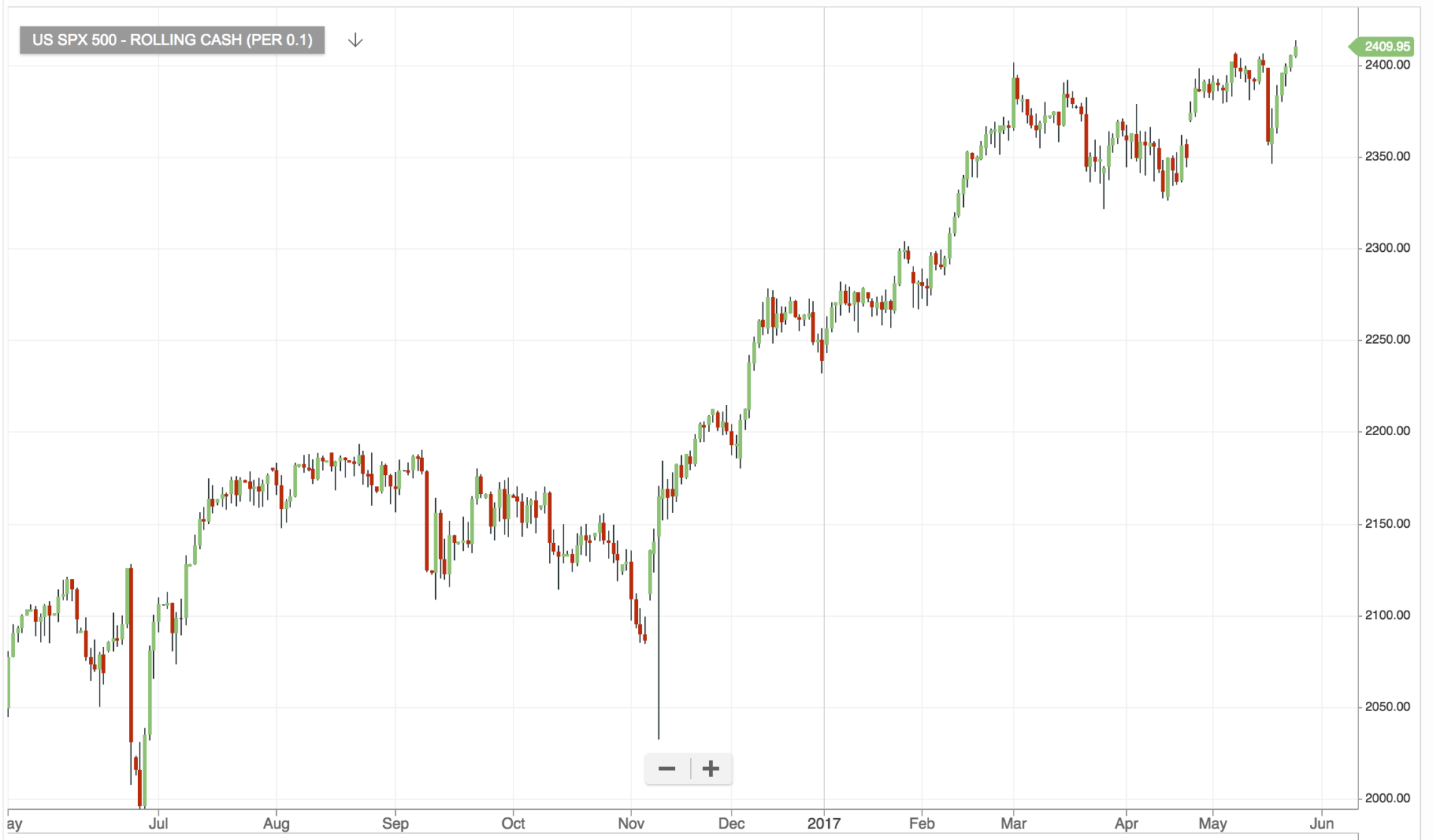
Here’s a view of the S&P over the last year …
A clear up trend – there’s nothing ambiguous about that … right?
Surely we all bought in early and made a killing … right?
But, in reality, all we need to do is zoom in on that curve, and it evaporates.
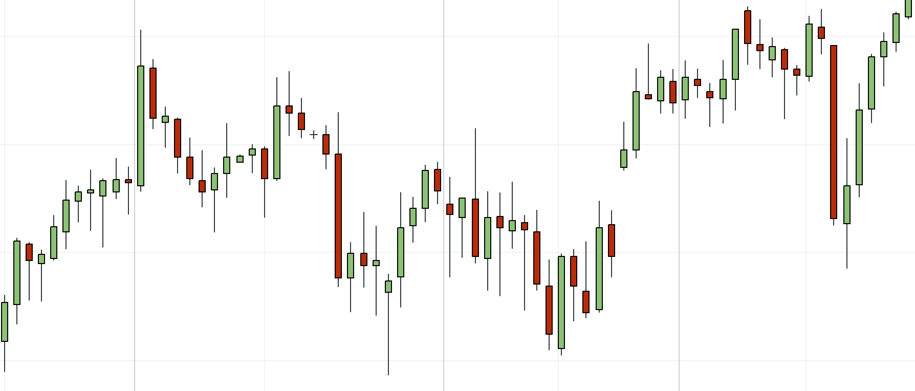
Here I’ve zoomed in on March/April this year …
The closer you look, the less you see …
Of course, the markets aren’t a magician trying to pull the wool over your eyes. But sometimes it can feel that way. No matter how hard we stare at the candles, it’s impossible to fathom what they’re telling us.
And that’s where some tools of the trade come in handy. And we realise that traders didn’t invent technical indicators just because they like drawing lines on their charts!
We don’t need anything really fancy – sometimes the simplest indicators have the most powerful effect on our charts.
And a great place to start is with a 200-period moving average.
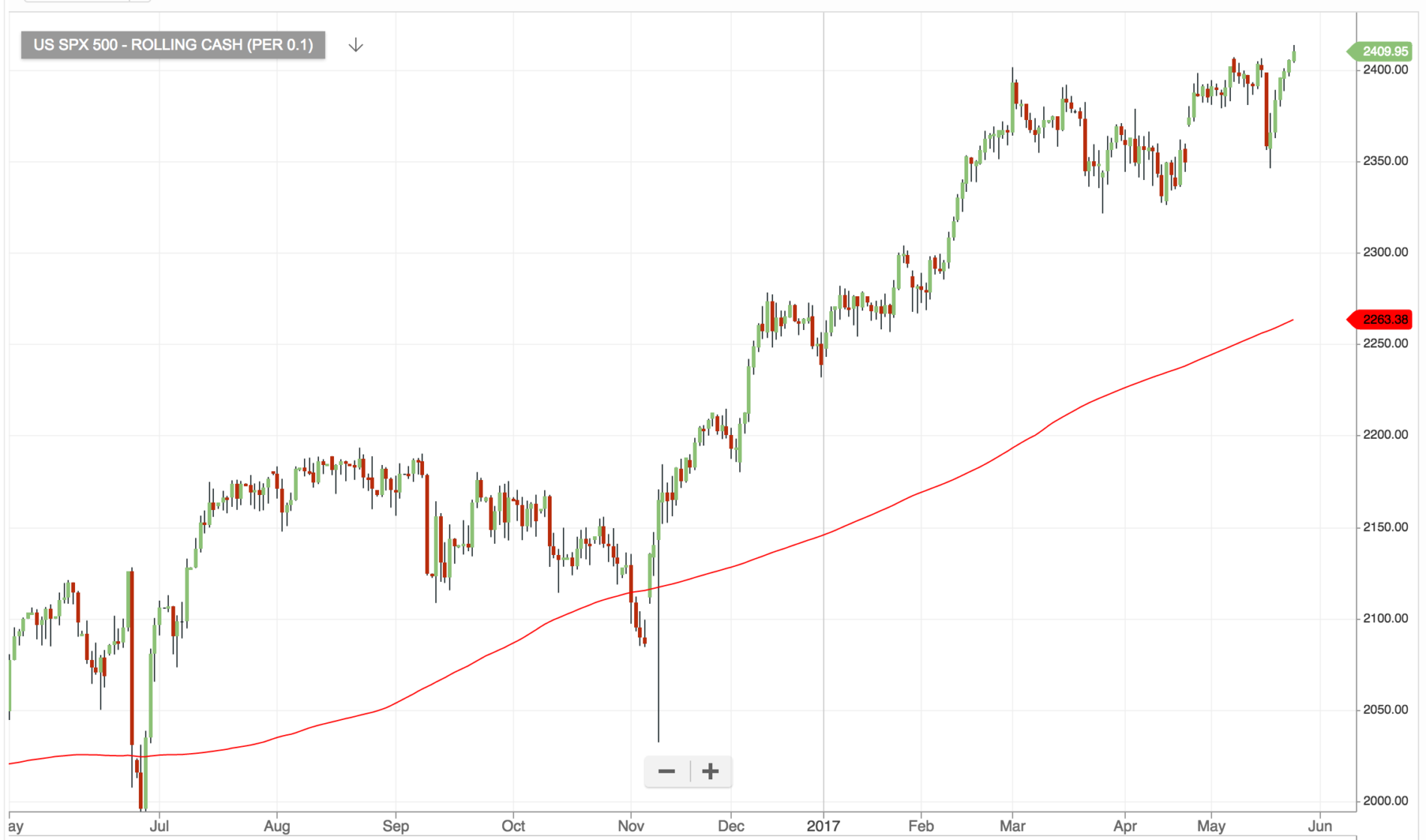
Here’s what our S&P chart looks like with the 200MA drawn in …
The 200 moving average is nothing more than the average price over the last 200 periods plotted as a line.
As an indicator, it’s a blunt, but highly effective tool.
It tells us the general direction of the market – which is great if we’re trading long term – but it’s slow to pick up on trend changes, so for shorter-term trades, it’s just not reactive enough.
It we really want to filter out buy trades when the trend just isn’t strong enough – the 200MA isn’t going to do it (alone).
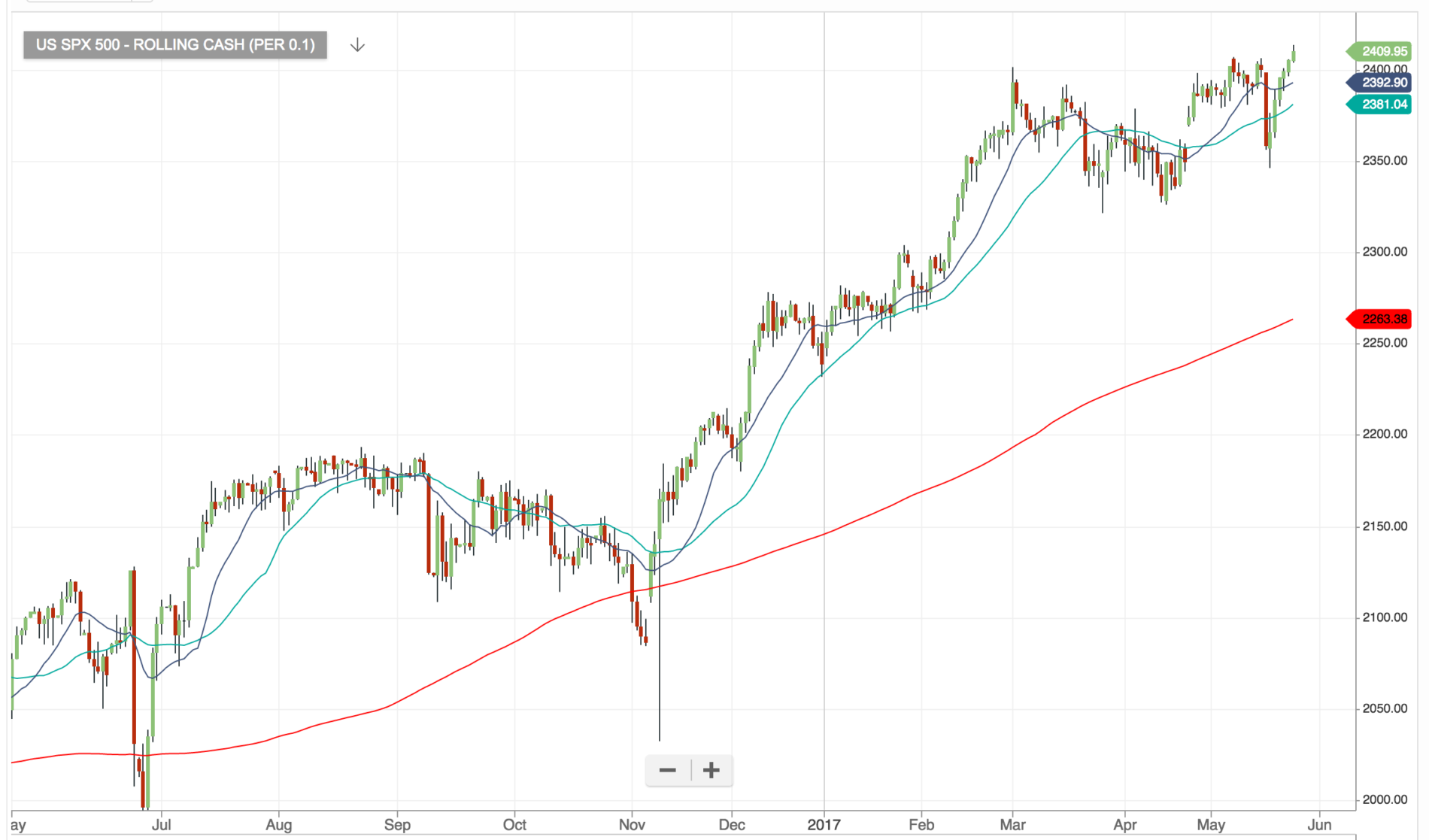
So, I’m going to add another couple of moving averages …
Now I’ve got a 15-period moving average (in dark blue) and 30-period moving average (light blue). For confirmation of our uptrend, we want the dark-blue line to be above the light-blue line.
So, here’s our filter for a buy trade …
price must be above 200MA
15MA must be above 30MA
And our filter for a sell trade …
price must be below 200MA
15MA must be below 30MA
Moving averages are lagging indicators, and – like all indicators – they’re very fallible. However, adding this simple filter to your trading strategy can mean that you’re automatically trading in the direction of the current, which means our trades can go further, faster.
(You can find more of my favourite trend indicators here.)