November 21, 2014by Mark Rose- 3 comments
Camels, kangaroos and the price of gold
I know I’m not the only one who’s started looking for comedy animal shapes in my charts.
It seems to be building into a craze, following the high-profile vomiting camel pattern at the beginning of this month.

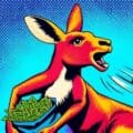
Promptly followed by the sick kangaroo …

Will the madness never end? And what does it all mean?
Other than clearly illustrating that when traders look at charts too long, they start mucking about at the back of the class …
It also shows us that both gold and the Aussie dollar have been getting smashed over the past year. Plus, it gives us a great animal-themed angle on how strongly correlated markets work …
Gold is an interesting case … it can be viewed as a currency, as a commodity, or as a hedging instrument.
First we’ll look at the gold currency – or both of them.
Many people trade gold as XAU/USD – which is the value of gold priced in US Dollars.
On the XAU/USD chart, gold has broken below critical support around 1185, off the back of a surging dollar, given a fresh boost from the Bank of Japan (as we saw last week).
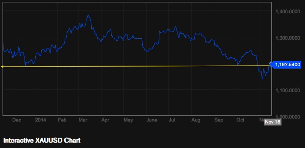
Although it’s bounced back from this fall, the picture continues to look bearish.
But there’s another gold currency … AUDUSD.
The Australian dollar is strongly correlated to gold due to Australia’s extensive gold mining operations. Plus, both are priced in US Dollars – so if the US dollar strengthens, both assets will fall in value.
The Australian Dollar has also broken below a key level at 8650, and is looking bearish. And many traders will trade AUDUSD instead of the metal itself because it gives you such direct access to gold fluctuations. Plus, there’s an extra benefit … the Aussie dollar carries a 2.5% banking rate, so they can earn interest on a long AUD position.
This chart shows how AUDUSD and XAUUSD have moved into and out of alignment over the past year …
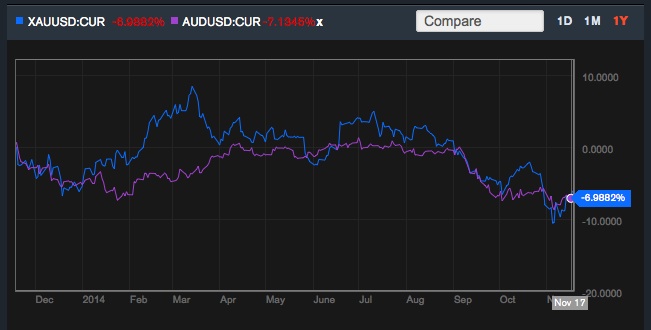
Strongly correlated markets like this give us excellent trading opportunities – and ones that are naturally hedged.
Essentially, trading this pair cuts out the USD effect, and looks at XAUAUD – a hedged market, which gives natural stability, plus the bonus of picking up interest for long-term investors on any long AUD trade.
If we look again at all those wobbles between the prices on the chart above – each time they move out of alignment, we know that there’s strong pressure for the prices to move back into alignment – and where there’s strong pressure on a price – there’s money to be made!
Anybody who already trades Martin Carter’s Diff Code on oil or European markets will know exactly how clever this kind of trading is.
If there are any other correlated markets you’ve been trading, I’d love to hear about it. And – of course – any animal patterns in the charts – post them here!
To enjoy more content and get it faster







3 comments
Ray
Most interesting article, Mark! I have always wanted to trade gold because of its long smooth movements but been put off by the large spreads on xauusd. Never realized I could effectively do the same with audusd.
Mark Rose
Love it!
Claire M
Great post Mark. Agreed – this could become an addictive pastime! The Tesco Dragon is unwell (must be something going round).

I clearly have too much time on my hands!