December 6, 2013by Mark Rose- 5 comments
3 MACD indicator techniques to master trends
Whatever timeframe or market you trade, one of the most important things a trader wants to know is:
Are we in a trend or not?
If we could successfully tell when a market was trending, and when it was stuck in a range – well, we’d be very rich indeed.
It’s dead easy to spot the trending areas and range-bound areas of a chart in retrospect …
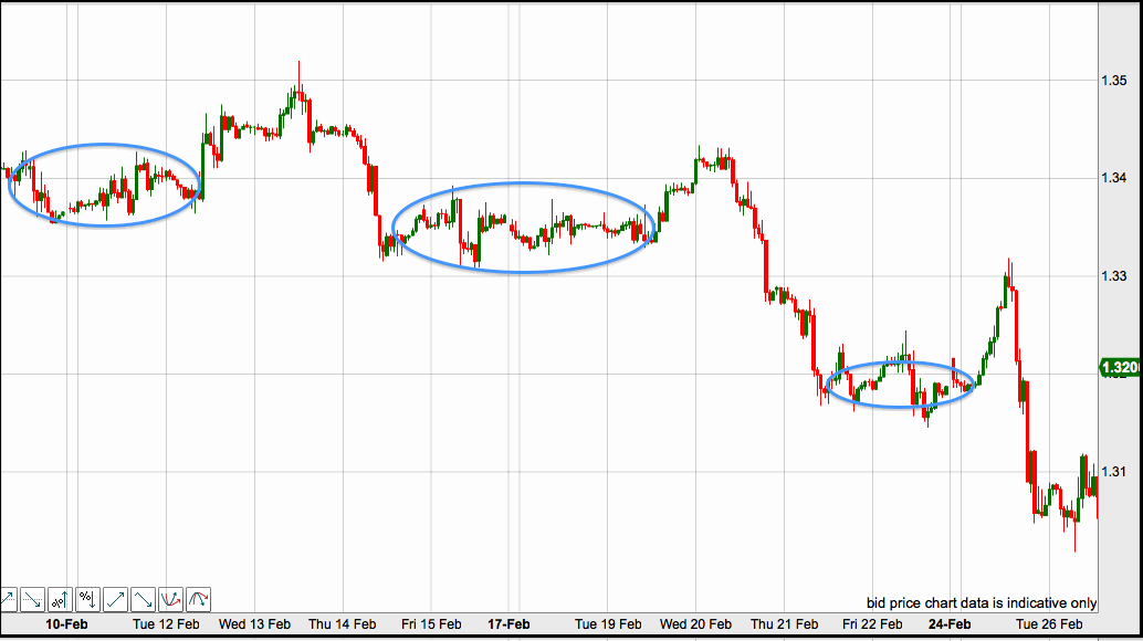
But, unfortunately, there’s no failsafe method for doing it in the here and now … but the good news is that there are some tools that can help us.
The most basic one of these is as moving average. But, if you want to use something a little more sophisticated, you can use a moving average of a moving average – otherwise known as the MACD indicator.
The MACD indicator is a very powerful tool for traders. At first glance, it can look a bit complex, with two lines, plus a histogram. But once you know what are the signals to look for on it, it becomes very quick and easy to read.
Here, I’ll look at two ways to use it that you may already be familiar with … and then a third, that is less conventional …
What the MACD Indicator is
The MACD measures how two moving averages are moving in relation to each other. And then … it plots the result as a moving average!
So, here’s what our MACD indicator looks like …

What you have are two lines and a histogram.
These are built from three numbers that you specify: the first is the number of periods for the faster moving average; the second is the number of periods for the slower moving average; and the third is the number of periods used to calculate the moving average of the difference between the faster and slower moving averages. Still with me?
For the lines that you see on the chart, the faster one (the blue one) is the moving average of the difference between our faster and slower averages. The slower line (the red one) is a smoothed out moving average of the first one. The histogram plots the two lines moving closer together and further apart.
If all that is making your head hurt, there’s good news … you don’t need to worry about how the lines on the chart are calculated – you just need to spot simple signals on them.
1. Crossovers
The important thing we want to look at on a MACD indicator is how far apart the two lines are. We can do this by looking at the two lines moving together or apart, or by the size of the histogram.
When the fast line crosses over the slower line, we have a bullish signal of an upward trend. And when the faster line crosses under the slower line, we have a bearish signal of a downward trend.
The histogram can show this very clearly, with the growing green bars for a new bullish trend, and the growing downward blue bars for a new bearish trend.
The buy or sell signals occur when the lines crossover, or when the histogram crosses the midline.
Here’s how it works …

However, moving averages are lagging indicators, which means that they can be prone to spotting trends after the event. As moving averages of moving averages – MACDs are even more prone to this problem, which can make them unreliable to spotting new trends.
This is why many traders prefer to use a MACD indicator to tell us when a trend might be running out of momentum – we do this by watching the size of the histogram bars begin to diminish, which tells us that it could be time to take profits.
2. Convergence and divergence
This method just looks at the histogram, and compares what it’s doing to what’s going on with the price chart above it …
In this example, the price hits a new high …

However, any trader following this trend should see a red warning light on the MACD histogram – the histogram has failed to reach the previous high, so we have divergence on the two charts.
This signals that this trend could be running out of steam and that the price might be about to take a downturn – which, as you can see on the chart, it does almost immediately.
3. Channel filter
This method isn’t to give us a signal, but is instead an additional filter to add to any trend-following strategy. What it does is keep us out of trades that could be trouble …
Again, we’re interested in the histogram …

I’ve drawn a channel either side of the centre-point of the histogram, and this tells me when the market is range-bound. If the histogram is within the channel – I shouldn’t take any trend-following trades; if it’s outside the channel – it’s safe to go with the trend.
This filters out a lot of signals, but should make the ones we take much more reliable.
Measuring trends
The MACD indicator is just one of the ways we can spot new trends and measure the strength of continuing trends. It is a very popular tool among traders, and the histogram makes it quick and intuitive to read, which always helps when we have to make trading decisions.
Because of it’s lagging nature, I believe the MACD works best as a filter, or to tell us when it’s time to close a trade – look for something faster for getting into trades.
Check out more trend indicators here.
Save








5 comments
Mark Rose
Hi Mike, Thanks for the feedback. I’m afraid I don’t have a set level to position the channel. I recommend looking back over the charts that you’re trading to see what ‘would have worked’ – and positioning them accordingly. I’ve been wanting to do more testing on this technique, but just haven’t found the time yet. It’s another thing on the ‘to do’ list!
ebem
wow this very real educative and l would prefer the setting of 41,43,3 it look like profitable setting combined with parabolic and candle pattern. thanks for sharing. please mark how to trade convergence a
and divergence with histogram of MACD ? thanks in advanced
Mark Rose
Thanks for your comments. I’ll try to include some more stuff on trading divergences in a newsletter soon – make sure you’re signed up to receive them.
Mike
Hi Mark,
Interesting article about the MACD.
Where on either side of the zero line do you recommend placing the 2 lines to form the channel ?
Simon
Never quite got to grips with Macds myself, but might give them another try after reading this. Cheers