February 8, 2013by Mark Rose- 1 comment
How to use the MACD indicator to grab a trend
Thanks for all the positive feedback on last week’s newsletter – it would seem that Bulletin readers are primed and ready to look into some serious medium- to long-term trading techniques – the kind of the stuff that’s for serious money-making.
The key to longer-term trading techniques always comes down to identification of trends (or lack of them). Markets don’t move in straight lines – so trends are, by their very nature, wobbly.
And at times, they are so wobbly that it becomes almost impossible to decipher the trend at all.
If there’s no trend, then this is where the trend-following trader must sit out. This can be painful for traders who want action, action, action, but long-term profitability is as much about knowing when to sit out as it is about catching the right moves.
Measuring the strength of trends is surprisingly tricky, which is why we often turn to trading indicators to help us out.
The primary tool for reading market trends is the moving average.
If you’ve been following Trader’s Bulletin for a while now, you’ll know that I’m a fan of the moving average – sure, it’s not the most sophisticated tool, but it’s intuitive, easy to understand, and gives clear information without pretending to be some flawless indicator to end all indicators!
If you want to check out my most basic moving average crossover strategy, you can read about it here – but for today, I’m moving on to something that I promised to cover a couple of weeks back … the MACD indicator.
Moving averages – with bells on …
Moving averages can be a little like chocolate biscuits – you can’t help but think that if one is good … two must better … or maybe three … and before you know it, you’ve turned your chart into this …
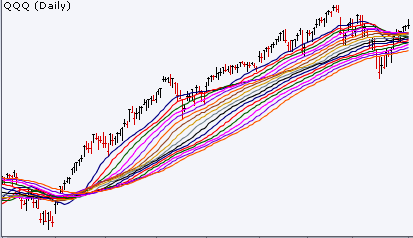
Yep, you’ve gorged yourself on the whole pack and now you can’t even move!
What the MACD does, instead, is, rather than keep on adding more and more moving averages – it measures how two moving averages are moving in relation to each other. And then … wait for it … it plots the result as a moving average!
Feel like you’re stuck on one of those bonkers Escher staircases?
Welcome to the world of stats!
So, here’s what our MACD looks like …

What you have are two lines and a histogram.
These are built from three numbers that you specify: the first is the number of periods for the faster moving average; the second is the number of periods for the slower moving average; and the third is the number of periods used to calculate the moving average of the difference between the faster and slower moving averages. Still with me?
For the lines that you see on the chart, the faster one (the blue one) is the moving average of the difference between our faster and slower averages. The slower line (the red one) is a smoothed out moving average of the first one. The histogram plots the two lines moving closer together and further apart.
If all that is making your head hurt, there’s good news … you don’t need to worry about how the lines on the chart are calculated – you just need to know what they’re telling you.
Convergence and divergence
The key concepts you need to spot on a MACD is convergence and divergence. I.e. that the two lines are moving together or apart.
When the fast line crosses over the slower line, we have a bullish signal of an upward trend. And when the faster line crosses under the slower line, we have a bearish signal of a downward trend.
The histogram can show this very clearly, with the growing green bars for a new bullish trend, and the growing downward blue bars for a new bearish trend.
The buy or sell signals occur when the lines crossover, or when the histogram crosses the midline. However, we can also watch for a trend running out of momentum as the size of the histogram bars begins to diminish.
Convergence and divergence – again …
While the MACD indicator is essentially about the convergence and divergence of the two moving averages it plots, there’s another type of convergence and divergence that traders are watching with this tool.
Take a look at the chart below …

As the price hits a new high, traders following that trend should see a red warning light on the MACD histogram – the histogram has failed to reach the previous high, so we have divergence on the two charts.
This signals that this trend could be running out of steam and that the price might be about to take a downturn – which, as you can see on the chart, it does almost immediately.
Measuring trends
MACD is just one of the ways we can spot new trends and measure the strength of continuing trends. It is a very popular tool among traders, and the histogram makes it quick and intuitive to read, which always helps when we have to make trading decisions.
Of course, as with all trading indicators, it’s not infallible and has its weaknesses. Because the MACD is built on moving averages (and then takes an average from those averages) it is a very “smoothed out” tool. This may save us from false signals, but it means that it can have a serious lag, which when the markets are choppy can mean that we miss the moves altogether.
And, as I often repeat, understanding the weaknesses of our indicators is one of the most important parts of using them successfully.
There are many other methods of identifying trends, and you can find my selection of the best here.
Save








1 comment
Mark Rose
Apologies, the link to my simple moving average strategy was missing from the email. Here it is:
https://www.tradersbulletin.co.uk/a-diy-trading-strategy