May 9, 2014by Mark Rose- 0 comments
Why noise is ruining your trades, and how to stop it
Last night I was helping my son with his homework, which involved me timing him while he tried to answer as many times-table questions as he could in 5 minutes.
But there was a problem … his little brother decided to stand by the door to the room shouting out random numbers … “62” … “18” … “28” …
This didn’t help with the homework … nor did it help family harmony.
But it’s a good example of what a negative effect background noise can have on our performance.
Tests have shown that children achieve lower test scores as a result of background noise – I’m not talking about revving traffic here, or annoying siblings – just the steady hum of an air conditioner is enough to affect their scores.
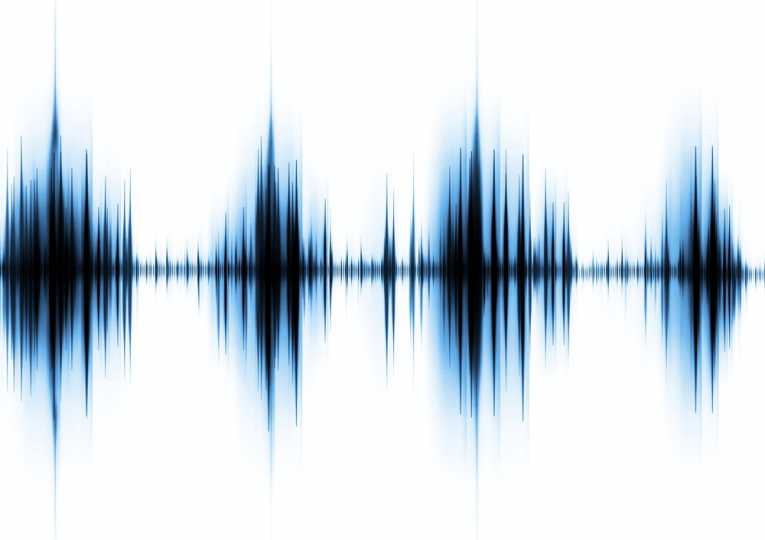
The noise that affects our trading isn’t coming through our ears – but on our charts, and our datafeeds.
Noise is those candlesticks that look like a breakout … but go nowhere.
Noise is the rabble of tweets about a certain stock that causes a big swing of volatility.
It’s been shown that firms who are active on Twitter have more volatile prices … after good earnings news, their shares will rise more (and fall back more quickly). This is because, like a feedback loop, noise generates more noise. Tweets generate more tweets.
We need to distinguish between noise and genuine activity.
But how?
Here are three methods …
1. The moving average
The most basic noise filter for your charts is a moving average. Here, a 20-period moving average smoothes out the bumps in our chart, giving a clear picture of the overall trends …
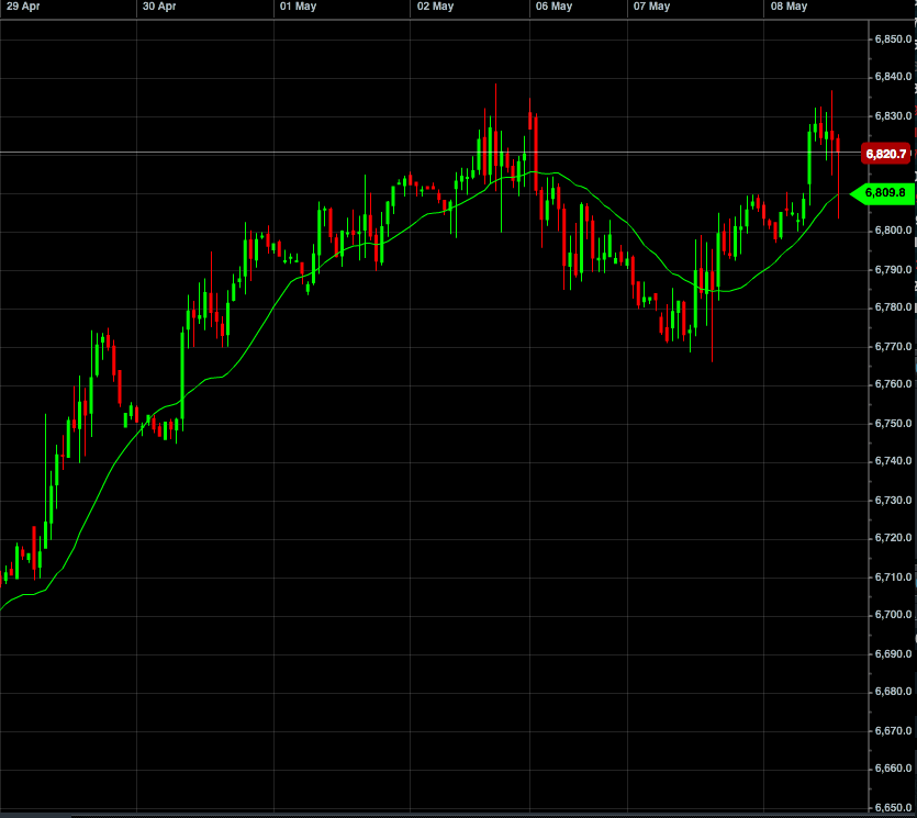
However, moving averages are based on the previous x-number of periods (the more periods you use, the smoother they are) – which means, by definition, they are lagging. They just tell us about what has happened – not what’s happening now.
While that can be valuable information, it’s not what gets us in on our trades nice and early.
2. The Renko chart
At the other end of the spectrum are Renko charts, which ignore time altogether and look only at ‘blocks’ of price movement.
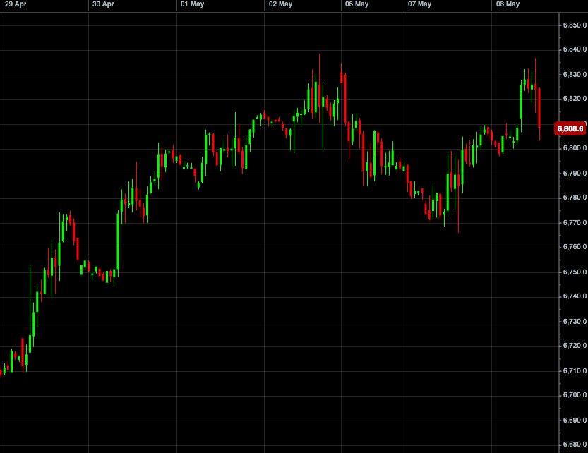
Here’s an example of a normal price chart, with lots of noise, spikes and false moves …
And here’s the same time period shown in a Renko chart …
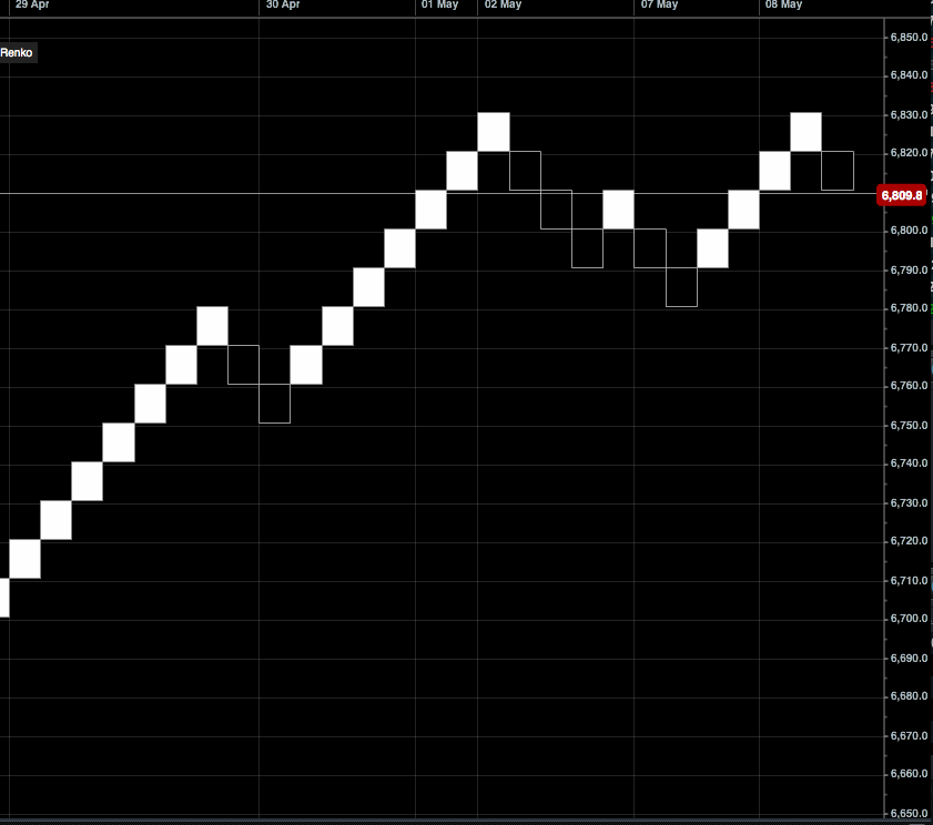
The ‘noise’ has been filtered out, and we can clearly see the trends. Notice that time only moves on when price changes – if price stays the same, it doesn’t move.
But my new favourite tool for filtering noise isn’t lagging … and it doesn’t require you to learn a completely new type of charts …
They’re the exact same candlesticks that you’re used to reading, but with a crucial piece of information added that will revolutionize your trading …
3. Extreme candles
These are the candlesticks that I’ve been raving about for the last few weeks.
They look almost identical to our normal candles, but with an extra piece of information. The colour no longer refers to whether they are ‘up’ or ‘down’ candles (that information is shown in the small ticks on the candle bodies – and, lets face it – you can normally tell at a glance if a candle went up or down).
Instead, here the colour refers to how much activity went with the candle. This way, you can instantly see which candles indicate trader activity … and which are just hot air.

A red candlestick tells us that people are buying and selling (not just talking about it!). So, with extreme candles, you can see at a glance, where the activity is – and which moves are just ‘noise’.
I’m completely sold on these as a trading tool. Activity levels are such an important piece of information that are so often missing from our charts, and alternative methods of measuring it (like Renko charts) just aren’t intuitive enough.
If you missed my email earlier this week about how to start using extreme candles, you can still get all the details here. It’s part of a highly recommended trading system from George Hallmey, and I genuinely believe this is trading tool we’ll see a lot of.
Please don’t forget to try these out for yourself along with George’s simple strategy showing you how to apply them here: Extreme Trader