Support and resistance are often easy to see after the event.
If you’ve ever thought, ‘Ah, of course that trade lost for me – the price was always going to struggle to get through that resistance, which I’d failed to notice.’ – you’re in good company.
But if we know where prices are likely to turn ahead of the event, then we’ve got a considerable advantage – it’s the closest we as traders get to seeing the future!
And being able to see into the future is, without doubt, going to make us richer!
So, if you want to find support and resistance levels – here are 6 smart tools that’ll do the job …
1. Looking left
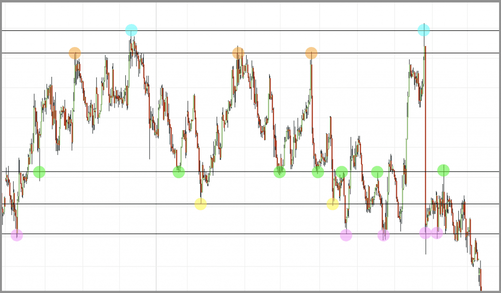
It’s the classic, low-tech way to do it, but it’s simple and it works. To find support and resistance levels, we just need to look to the left on our charts at where prices have turned or consolidated in the past.
There are all kinds of ‘rules’ about this – whether you use the wick or the body … how many touches makes it a real level … the more touches the stronger a level is …
Unfortunately, the markets aren’t aware of these rules and just don’t play by them. My advice is just to look at where prices have struggled or turned in the past, and to take note of them. Sometimes wicks will poke their heads through a level … sometimes whole bodies will push through them … and sometimes a single touch can highlight a very strong key level.
The image below shows how past instances of prices bumping against levels can give real clues about how the price will behave next time it comes to that price …
2. Pivot points
Pivot points are key levels that can be drawn onto a chart at the start of each day, based on the previous day’s price behaviour.
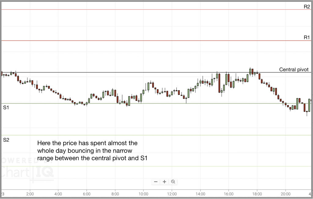
The main pivot points are five levels – the central pivot, support 1 and support 2 below it, and resistance 1 and resistance 2 above it. These levels have a push-pull effect on prices, and you’ll often see prices pulled in towards pivot levels, before bouncing off them.
Here are a couple of examples of the trading range in a day, with the pivot levels marked in …
3. Fibonacci levels
While historical levels are up to you to draw in yourself, and pivot points will be added in automatically by your charting software at the click of a mouse … Fibonacci levels fall somewhere in the middle.
Fibonacci retracements can help us anticipate where prices will turn in a pullback, and Fibonacci extensions can give us an idea of how far prices will run.
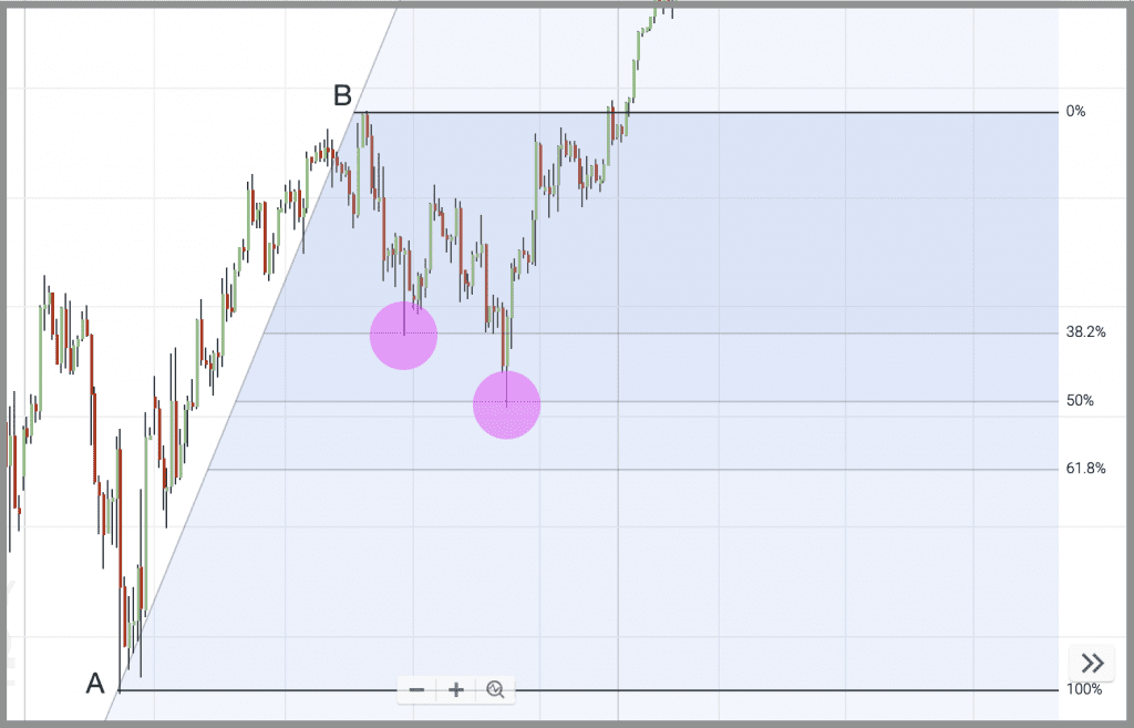
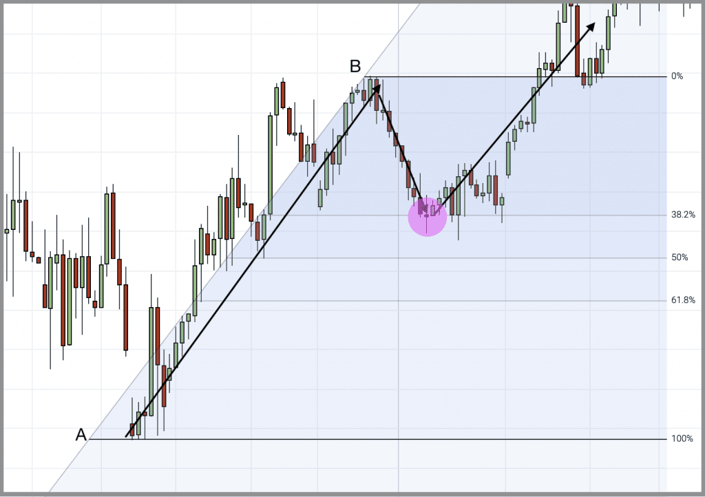
Most charting software will draw in Fibonacci levels for you, with just the recent swing high and low specified. Here are a couple of examples …
In the chart above, I’ve marked my recent swing higher, from the low at A to the high at B. Price is retracing from B, and I want to find a good entry back into the market. We can see the price hesitate on the 38.2% Fib level, and then turn decisively on the 50% Fib, before resuming the trend direction.
Similarly, in the chart above, we have a swing high-low from A to B. This time, the retracement comes neatly at 38.2%, before resuming the trend.
4. Round numbers
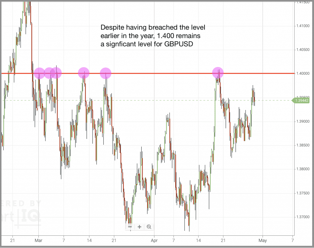
When we’re poring over our charts, looking for historical levels, pivot points, Fibonacci levels … it can be too easy to miss a round number that’s staring us in the face!
Because the markets are driven by people, and we humans love the simplicity of a round number, these key levels naturally become turning points for prices.
Here, we can almost hear the investors say, ‘I wouldn’t hold Sterling above 1.40 Dollars’ …
5. Trend lines
The ways to find support and resistance we’ve looked at so far have all been horizontal lines on your chart. But, as we know all too well, markets don’t move in straight lines – so why should your S&R levels …?
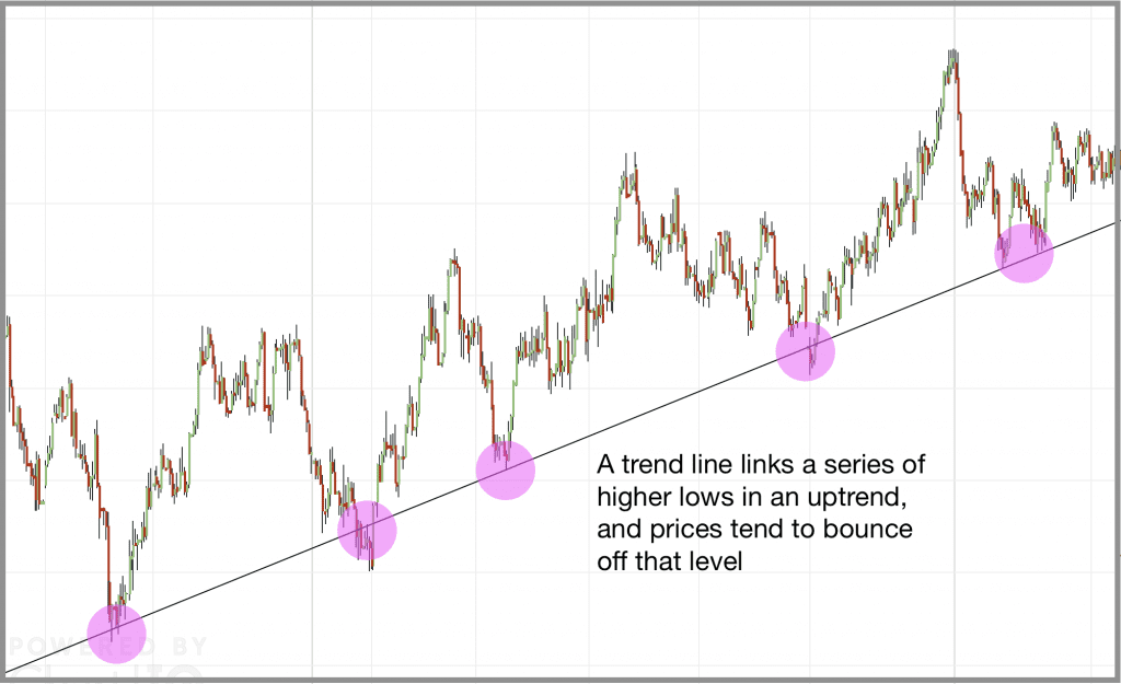
Trend lines are diagonal lines we can draw on charts, which link up a series of higher lows, or lower highs …
Here, I’ve linked up these higher lows in an up trend. This dynamic trend line then becomes a support level, with the price bouncing away from it as it retraces and then resumes market direction.
6. Moving averages
Not all trends line up nicely along a trend line – often markets are messier than that, with steep trend lines for a while, before falling back to a more shallow trend, then accelerating away again.
Moving averages can help here, offering support or resistance which can accelerate and decelerate along with your trend. And it’s very common to see prices bounce off major moving average levels, like a 20, 50 or 100 MA.
Here you can see the 50 simple moving average following the price. When retracements occur in this trend, the price is finding support on the 50SMA line as buyers come back in.
How to use them to find support and resistance
So, that’s six very practical and valid ways to apply support and resistance to your charts. The problem most of us run into though is just the overwhelming amount of data we’d be dealing with if we tried to apply all this to our trading – multiple pivot points, Fib levels, moving averages … historical highs and lows …
Our charts would be littered with lines, and no doubt, the price would turn on one of them!
I recommend that you don’t apply all of these – just focus on one or two techniques, and become good at applying them. No support and resistance tools are going to be infallible, but the more confident you become at using them, the better you can use them to your advantage.
You’ll also notice in all the examples I’ve shown above, that support and resistance levels are rarely accurate pinpoints that the price bounces neatly away from – often they are messy, with the price consolidating around them, as that battle between buyers and sellers rages. When positioning your trading orders, beware of this behaviour, and give your S&R levels room to breathe.
Hello Mark,
Thanks, for the information, what do you look for to be confident that there is a reversal or a continuation from the support and resistance lines. Candle formation?
It’s a great question Bob, and one I wish there was a simple answer to.
It’s not uncommon for prices to look like they are bouncing off a level, only to turn around and catch us out (as could well happen in that first Fibonacci example above).
Candlestick shape is a really good starting point – a nice clear doji on a key level is a great signal.
Hidden divergence on an oscillator is also useful – for example, in an uptrend, the price is pulling back to a higher low, but the Stochastic hits a lower low (there’s more about this here: https://tradersbulletin.co.uk/what-is-hidden-divergence/).
And smart stop placement – where we’ve got S&R levels racked up behind each other, if one level fails, hopefully the next level will hold, and keep our stops safe.










2 comments
Bob
Hello Mark,
Thanks, for the information, what do you look for to be confident that there is a reversal or a continuation from the support and resistance lines. Candle formation?
Regards
Bob.
Mark Rose
It’s a great question Bob, and one I wish there was a simple answer to.
It’s not uncommon for prices to look like they are bouncing off a level, only to turn around and catch us out (as could well happen in that first Fibonacci example above).
Candlestick shape is a really good starting point – a nice clear doji on a key level is a great signal.
Hidden divergence on an oscillator is also useful – for example, in an uptrend, the price is pulling back to a higher low, but the Stochastic hits a lower low (there’s more about this here: https://tradersbulletin.co.uk/what-is-hidden-divergence/).
And smart stop placement – where we’ve got S&R levels racked up behind each other, if one level fails, hopefully the next level will hold, and keep our stops safe.
Regards,
Mark