You know that disorientating feeling when you’ve got jet lag … you wake up in a dark hotel room and you’re not sure if the clock is telling you it’s five in the morning or five in the afternoon …?
Normally, we have things around us that give us our bearings … the sun rising, our body clocks, daily routines …
In the markets, it’s easy to lose our way when we’re flitting between timeframes and instruments.
Add into that the barrage of news and data hitting us, and how we think markets will behave in the face of it. In recent years, these things have become unhinged … central banks have been more proactive, meaning that news often causes the reverse market reaction of what would be expected … and short-term options trading has caused the VIX behaviour to change …
But there are two lines that can act like a compass needle in the markets. If you always know which side of these two lines the price is, you’ll have a clearer idea of where the market is coming from, where it’s going to, and where you stand.
I’m talking about the 50 and the 200 simple moving average lines.
How to read a death cross
Here we see the 50ma crossing beneath the 200ma this week on the DAX in what’s called a ‘death cross’.
As the name suggests this is not a great omen.
A death cross is just about the most reliable indicator of a bear market out there.
And there’s been quite a flurry of them in recent weeks.
Death crosses (and their positive flipside, Golden Crosses) don’t come along that often, but that doesn’t mean that we should lose any interest in where our two moving average lines are.
Two golden indicators of direction, support and resistance
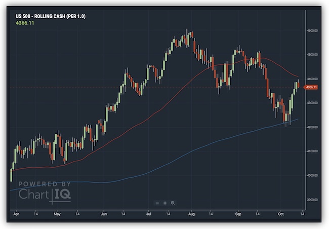
The 50 and 200 moving averages provide critical support and resistance levels for prices, as we can see on this chart of the S&P500 …
While a death cross is still a way off, early this month, prices had dipped right down to the 200 moving average, where they have found support and are now back up within spitting distance of the 50ma.
Note how the two moving averages lines affect turning points in the price as well as showing the long-term market direction.
How to use this in your trading
Death crosses and interactions with the 50 and 200 moving averages aren’t signals to buy or sell. Instead, they are a map that positions where prices are and what we can expect going forward.
It’s about big-picture thinking.
And it’s more important than ever, when ‘norms’ are breaking down.
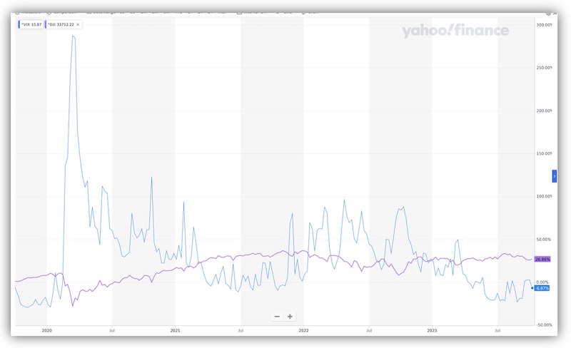
Here’s the VIX index – commonly seen as a measure of market ‘fear’ – which will generally spike up at any whiff of a downturn or uncertainty. The purple line on the chart is the S&P – note how dips on the S&P cause a massive reaction on the VIX (here you can see my post in March 2020, when the VIX reading went off the scale) …
Until recently, that is.
The VIX has barely reacted to recent falls on the S&P, meaning that our usual early warning system for a bear market just isn’t working any more.
So, we need to rely on other metrics.
With that in mind, make sure that in any instrument you’re trading, you know where the current price is in relation to these two key measures. It’s just good practice.