As I’m bored of hearing myself tell my kids, usually
while waving a musical instrument at them … you’ll improve faster if you
practice more often.
And that’s exactly why day trading is a great place to
get good at reading price action. That’s true even if you never plan to day
trade – by practicing these skills in demo mode, you’ll see your price action understanding
improve in all timeframes.
Here I’m going to run through the 4 top price action
strategies to look for …
Price action
strategies 1: Direction
It’s easy to zoom in on each candlestick popping up on
the right of our screens to the point where we lose track of the big picture.
We’ve all done it.
Whatever timeframe you’re trading, you should always
have an idea of what the overall market direction (or lack of direction) is.
Is the trend up? Down? Sideways?
If you can’t answer this about the market you’re in,
the first thing you should do is have a firm word with yourself. Then, switch
into a longer timeframe and look at the chart.
Is the price in a trend? Is it stuck sideways?
If you find it hard to see trends, just pop a longer
term moving average onto your chart and see which way that is lying.
Here’s an example …
Knowing that the 4 hour chart for EURJPY looks like this …
I.e. that there’s a clear uptrend in progress …
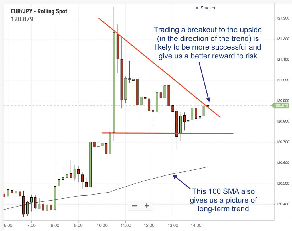
Gives us a better idea of how we’d want to play a breakout from a consolidation pattern on the same instrument, but in a 15 min timeframe …
Price action
strategies 2: Levels
You can use all the technical indicators in the world,
but nothing will give you a better idea of where markets will turn than support
and resistance levels. For that reason, it’s very important to be aware of
them.
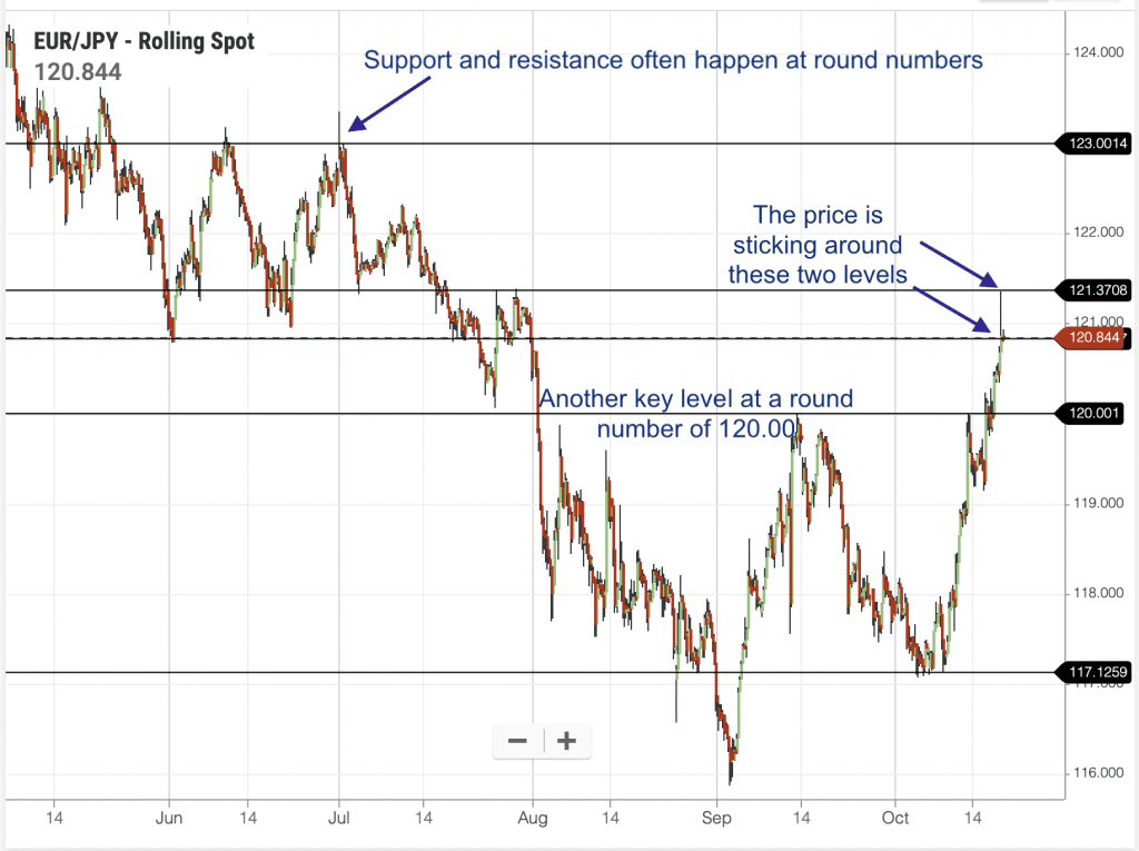
Looking at that EURJPY chart again, zoomed out a bit further, we can get some very useful information for our trading …
The price has bounced off a resistance level at 121.37,
so if we’re looking to buy, we may want to position our target below that
level.
There are all kinds of rules about drawing on S&R
levels. My advice is not to get too bogged down in the ‘rules’. (The markets
definitely don’t care about the rules!)
You can find some detailed advice on drawing S&R lines HERE – including my advice on which ‘golden rules’ to listen to, and which to ignore!
Price action
strategies 3: Candlestick Patterns
When you
think of price action – candlestick patterns are probably the first things that
come to mind. However, without direction and key levels ticked off the list,
any patterns we find will be in isolation, and have little value.
What should
make us pay attention is when patterns form at key levels.
Reversal
patterns in candlesticks may sound enticing, but the reality is that prices
don’t reverse very often, so these patterns just aren’t as useful as
consolidations. These are very important patterns, they crop up all over our
charts, and offer great opportunities to jump into trends.
Consolidation patterns come in many shapes and sizes … rectangles, pennants, flags, triangles … but they are all about the price bouncing between two tight lines. They tell us that the price is ‘stuck’, and are often followed by a strong move, offering a good profit opportunity …
Price action
strategies 4: Reading bodies and wicks
Trading
text books are full of different types of candlesticks and what they all mean.
You can study those … or you can just learn to look at the wick of the candle, and
get all the information you need.
I believe
this is much simpler, and a more intuitive way to read charts.
Every
candlestick on your chart represents a period of time. If you’re looking at a
daily chart – each candlestick is a day. If you’re looking at a 5-minute chart,
each candlestick represents 5 minutes … and so on.
Within that candlestick, you can find information about where the price stood at the beginning of that time period … where it stood at the end of that time period … and any extreme highs or lows it reached during that period …
Not all
candles have wicks. If the price opened at the low, and closed at the high,
then you’ll have a solid green wick-less candle. A wick-less candle suggests a
market with a clear direction.
But most
have either an upper or lower wick, or both. These thin lines tell us that
during that period, the price moved up or down … and then turned around.
It tells us that trader sentiment is changing.
The longer
the wick, the greater the change in sentiment.
A long
upper wick shows a failed attempt to drive prices higher, which suggests that
sellers are taking control.
Likewise, a
long lower wick shows that prices fell, but buying pressure came back into the
market, bringing prices back up – this suggests that a support level has been
hit and we could see prices driven higher.
Where the wicks are long on both sides of the candle, again we see a battle taking place between buyers and sellers, but in this instance, there’s no clear winner.
Putting it all together
The best
way to get good at reading these signs on your charts is to put it in action.
And the fastest way to learn is on shorter timeframes.
I’m not
suggesting that you start risking money – get a demo account, and start looking
for these setups on shorter timeframes. There’ll be no shortage of them.
You’ll soon
get better at viewing trends, drawing S&R levels, spotting patterns, and
reading wicks.